特效介绍
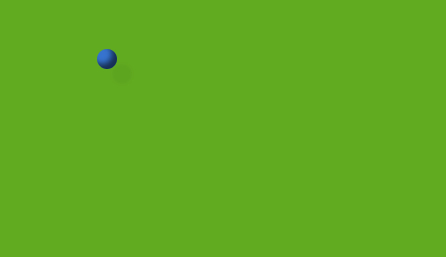 纯CSS3打造来回滚动和碰撞的立体桌球,碰撞效果符合力学,带有投影效果,没有用到一张图片。不兼容IE8以下内核的浏览器。
使用方法
1、把下面的CSS样式拷贝到您的html的头部:<style type="text/css">
body { background: #222; }
.box {
background-color: #61ab20;
margin: 0 auto;
width: 500px;
height: 300px;
position: relative;
box-shadow: inset 0 0 3px #000;
border-radius: 5px;
border: 1px solid #111;
overflow: hidden;
}
.box b {
display: block;
width: 20px;
height: 20px;
border-radius: 50%;
background-color: #3673cf;
box-shadow: inset -5px -5px 5px rgba(0,0,0,.6), 15px 15px 2px rgba(0,0,0,.04);
position: absolute;
-webkit-animation: moveX 3.05s linear 0s infinite alternate, moveY 3.4s linear 0s infinite alternate;
-moz-animation: moveX 3.05s linear 0s infinite alternate, moveY 3.4s linear 0s infinite alternate;
-o-animation: moveX 3.05s linear 0s infinite alternate, moveY 3.4s linear 0s infinite alternate;
animation: moveX 3.05s linear 0s infinite alternate, moveY 3.4s linear 0s infinite alternate;
}
@-webkit-keyframes moveX {
from { left: 0; } to { left: 480px; }
}
@-moz-keyframes moveX {
from { left: 0; } to { left: 480px; }
}
@-o-keyframes moveX {
from { left: 0; } to { left: 480px; }
}
@keyframes moveX {
from { left: 0; } to { left: 480px; }
}
@-webkit-keyframes moveY {
from { top: 0; } to { top: 280px; }
}
@-moz-keyframes moveY {
from { top: 0; } to { top: 280px; }
}
@-o-keyframes moveY {
from { top: 0; } to { top: 280px; }
}
@keyframes moveY {
from { top: 0; } to { top: 280px; }
}
</style>
2、把以下代码拷贝到你想引用的地方<div class="box"><b></b></div>