
1、让容器居中,同时将body背景变成灰色,可以看得更清楚:
html,body{
 height:100%;
}
body{
 display: flex;
 justify-content: center;
 align-items: center;
 background-color: #eee;
}
2、画一个蓝色渐变圆形,作为外边的蓝色环(现在还是圆,不是环),相对定位,这样里面的所有元素都可以以它为定位点了:
.logo{
 width: 300px;
 height:300px;
 background: linear-gradient(to right bottom,#66adff,#1a6adb);
 border-radius: 999px;
 position: relative;
}
<div class="logo"></div>
效果图: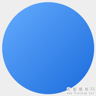
3、给 logo 的 after 上个灰色,做出镂空效果:
.logo:after{
 position: absolute;
 width: 150px;
 height: 150px;
 content:'';
 background-color: #eee;
 border-radius: 999px;
 z-index: 15;
 left: 50%;
 top:50%;
 margin-left: -75px;
 margin-top:-75px;
}
效果图:
4、给 logo 的 before 加上渐变背景,渐变色和 logo 一样,只不过颜色反过来,这样有凹陷的感觉,同时将它治愈 after 的下面,比 after 稍微大点:
.logo:before{
 position: absolute;
 width: 166px;
 height: 166px;
 content:'';
 background: linear-gradient(to right bottom,#1a6adb,#66adff);
 border-radius: 999px;
 z-index: 9;
 left: 50%;
 top:50%;
 margin-left: -83px;
 margin-top:-83px;
}
效果图: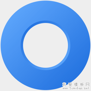
5、由于边框不支持渐变,我们只能接着加div,来画出刚才的 before 的高光:
.before-high-light{
 position: absolute;
 width: 168px;
 height: 168px;
 content:'';
 background: linear-gradient(to right bottom,#96d9ff,#5cafff,#96d9ff);
 border-radius: 999px;
 z-index: 8;
 left: 50%;
 top:50%;
 margin-left: -84px;
 margin-top:-84px;
}
<div class="logo">
 <div class="before-high-light"></div>
</div>
效果图: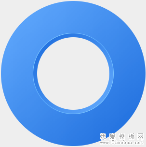
6、画左上角的大片高光,它是被遮挡在中间圆的下面,所以,z-index要更低,同时它的颜色是从半透明的白色到无,大小要比 logo 小个一两像素:
.left-top-high-light{
 position: absolute;
 width: 298px;
 height: 298px;
 content:'';
 background: linear-gradient(to right bottom,rgba(255,255,255,.8),rgba(255,255,255,0) 50%);
 border-radius: 999px;
 z-index: 7;
 left: 50%;
 top:50%;
 margin-left: -149px;
 margin-top:-149px;
}
<div class="logo">
 <div class="before-high-light"></div>
 <div class="left-top-high-light"></div>
</div>
效果图: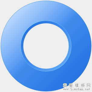
7、画云,一共三朵,放在右下角,白色背景,利用内阴影,给云上色(放在chrome调整,这块比较麻烦,需要细细调),由于css容器样式的局限性,不能让云成为一个整体,建议这类可以考虑用svg或者canvas实现,我这里还是用div来实现:
.clouds{
 position: absolute;
 width: 90px;
 height: 90px;
 background-color: #fff;
 border-radius: 999px;
 z-index: 16;
 bottom: 20px;
 right:60px;
 box-shadow: -3px 15px 12px 0 rgba(42,127,236,.3) inset;
}
.clouds:before{
 content:'';
 position: absolute;
 width: 100px;
 height: 70px;
 background-color: #fff;
 border-radius: 999px;
 bottom: -20px;
 left:-30px;
 box-shadow: 5px -5px 8px 0 rgba(42,127,236,.3) inset;
}
.clouds:after{
 content:'';
 position: absolute;
 width: 123px;
 height: 60px;
 background-color: #fff;
 border-radius: 0 999px 999px 0;
 bottom: -20px;
 right:-30px;
 box-shadow: -16px -9px 11px 0 rgba(42,127,236,.3) inset;
}
<div class="logo">
 <div class="before-high-light"></div>
 <div class="left-top-high-light"></div>
 <div class="clouds"></div>
</div>
效果图:
8、左下角,云之下的高光,这个高光容器,宽高为 logo 的一半,左下角为全圆角,其他三个角可以不设置圆角,z-index 置于前面所有内容的下面,logo 的上面,背景为从左上到右下,从无到有的白色渐变,如果觉得太生硬,可以稍微给点羽化:
.left-bottom-high-light{
 position: absolute;
 width: 150px;
 height: 150px;
 content:'';
 background: linear-gradient(to right bottom,rgba(255,255,255,0) 50%,rgba(255,255,255,1) 70%);
 border-radius:0 0 0 999px;
 z-index: 14;
 left:0;
 bottom:0;
 filter: blur(1px);
}
<div class="logo">
 <div class="before-high-light"></div>
 <div class="left-top-high-light"></div>
 <div class="clouds"></div>
 <div class="left-bottom-high-light"></div>
</div>
效果图:
9、底部阴影 shadow,可以用背景色+羽化来实现,也可以用 box-shadow 来实现,这里我们用第一种方法:
.shadow{
 position: absolute;
 width:200px;
 height:10px;
 content:'';
 background:#666;
 border-radius:50%;
 z-index: 1;
 left: 50%;
 bottom:-3px;
 margin-left: -100px;
 filter: blur(4px);
}
<div class="logo">
 <div class="before-high-light"></div>
 <div class="left-top-high-light"></div>
 <div class="clouds"></div>
 <div class="left-bottom-high-light"></div>
 <div class="shadow"></div>
</div>
效果图:
10、顶部高光 high-light,实现方法和上面的阴影一样:
.high-light{
 position: absolute;
 width:100px;
 height:20px;
 content:'';
 background:rgba(255,255,255,.9);
 border-radius:50%;
 z-index: 15;
 left: -8px;
 top: 33px;
 filter: blur(4px);
 transform: rotate(-45deg);
}
<div class="logo">
 <div class="before-high-light"></div>
 <div class="left-top-high-light"></div>
 <div class="clouds"></div>
 <div class="left-bottom-high-light"></div>
 <div class="shadow"></div>
 <div class="high-light"></div>
</div>
最终效果图: