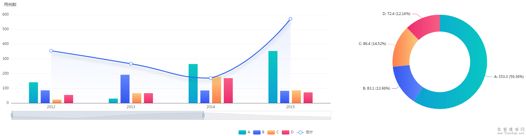
如果直接套用官网的效果,那么柱状图和线条的数据,都会渲染进右侧的饼图。在初始化数据时,必须根据左侧数据,重新组装右侧数据(默认右侧是统计左边,所以,要将左侧的数据进行累加):
//左侧数据
let leftData = [
    ['product', '2012', '2013', '2014', '2015', '2016', '2017'],
    ['A', 141.1, 30.4, 265.1, 353.3, 183.8, 98.7],
    ['B', 86.5, 192.1, 85.7, 83.1, 73.4, 355.1],
    ['C', 24.1, 67.2, 179.5, 86.4, 65.2, 82.5],
    ['D', 55.2, 67.1, 169.2, 72.4, 253.9, 39.1],
    ['总计', 355.2, 267.1, 169.2, 572.4, 353.9, 239.1]
]
//右侧数据
let rightData = [];
leftData.map((item,index) => {
    if(index!==0 && index!==leftData.length-1){
        let total = 0;
        item.map((item2,index2) => {
            if(index2!==0){
                total += item2;
            }
        })
        rightData.push({
            name:item[0],
            value:total.toFixed(2)
        })
    }
})
当鼠标浮动到左边的柱状图,右侧也要进行数据更新,实现联动:
myChart.on('updateAxisPointer', function (event) {
    var xAxisInfo = event.axesInfo[0];
    if (xAxisInfo) {
        var dimension = xAxisInfo.value+1;
        let rightData = [];
        leftData.map((item,index) => {
            if(index!==0 && index!==leftData.length-1){
                let total = item[dimension];
                rightData.push({
                    name:item[0],
                    value:total
                })
            }
        })
        myChart.setOption({
            series: {
                id: 'pie',
                data:rightData
            }
        });
    }
});
最终代码如下:
<div id="main"></div>

<script src="echarts.min.js"></script>
<script>
// 基于准备好的dom,初始化echarts实例
var myChart = echarts.init(document.getElementById('main'));

let winWidth = document.body.clientWidth;
let barWidth = winWidth*(30/1920);

let leftData = [
    ['product', '2012', '2013', '2014', '2015', '2016', '2017'],
    ['A', 141.1, 30.4, 265.1, 353.3, 183.8, 98.7],
    ['B', 86.5, 192.1, 85.7, 83.1, 73.4, 355.1],
    ['C', 24.1, 67.2, 179.5, 86.4, 65.2, 82.5],
    ['D', 55.2, 67.1, 169.2, 72.4, 253.9, 39.1],
    ['总计', 355.2, 267.1, 169.2, 572.4, 353.9, 239.1]
]

let rightData = [];
leftData.map((item,index) => {
    if(index!==0 && index!==leftData.length-1){
        let total = 0;
        item.map((item2,index2) => {
            if(index2!==0){
                total += item2;
            }
        })
        rightData.push({
            name:item[0],
            value:total.toFixed(2)
        })
    }
})

option = {
    backgroundColor:'#fff',
    title:{
        textStyle:{
            color:'#4c4c4c',
            fontSize:14,
            fontWeight:'normal'
        },
        text:'用例数',
        left:0,
        top:0
    },
    legend: {
        bottom:0,
    },
    tooltip: {
        padding: 10,
        backgroundColor:'rgba(255,255,255,1)',
        trigger: 'axis',
        textStyle: {
            color:'#333',
            fontSize:16,
        },
        axisPointer: {
            type: 'shadow',
            shadowStyle: {color:'rgba(150,150,150,0.1)'}
        }
    },
    grid: {
        left: '0',
        right: '40%',
        top: '10%',
        bottom: '20%',
        containLabel: true
    },
    dataZoom: [
        {
            show: true,
            realtime: true,
            start: 0,
            end: 60,
            bottom:'12%',
        }
    ],
    dataset: {
        source: leftData
    },
    xAxis: {
        type: 'category',
        //隐藏x轴刻度
        axisTick: {
            show: false
        },
        //设置x轴名称及x轴线条颜色
        axisLine: {
            show: true,
            lineStyle: {
                color: '#4d4d4d'
            }
        },
    },
    yAxis: {
        gridIndex: 0,
        //设置网格线颜色
        splitLine: {
            show: true,
            lineStyle:{
               color: '#f0f0f0'
          }
       },
        axisTick: {
            //隐藏x轴刻度
            show: false
        },
        axisLine: {
            //设置x轴名称及x轴线条颜色
            show: false
        },
    },
    series: [
        {type: 'bar', barWidth:barWidth, seriesLayoutBy: 'row', itemStyle:{ color: new echarts.graphic.LinearGradient(0, 0, 0, 1,[
            {offset: 0, color: '#09c7c1'},{offset: 1, color: '#0da1d4'}
        ])}},
        {type: 'bar', barWidth:barWidth, seriesLayoutBy: 'row', itemStyle:{ color: new echarts.graphic.LinearGradient(0, 0, 0, 1,[
            {offset: 0, color: '#6086fc'},{offset: 1, color: '#3555f1'}
        ])}},
        {type: 'bar', barWidth:barWidth, seriesLayoutBy: 'row', itemStyle:{ color: new echarts.graphic.LinearGradient(0, 0, 0, 1,[
            {offset: 0, color: '#fbc97d'},{offset: 1, color: '#fd7e4c'}
        ])}},
        {type: 'bar', barWidth:barWidth, seriesLayoutBy: 'row', itemStyle:{ color: new echarts.graphic.LinearGradient(0, 0, 0, 1,[
            {offset: 0, color: '#f85d85'},{offset: 1, color: '#eb2d6e'}
        ])}},
        {
            type: 'line', smooth: true, seriesLayoutBy: 'row', itemStyle:{
                width:30,
                color: '#2c63f0'
            },
            symbolSize:10,
            lineStyle: {
                width: 3,
                shadowColor: 'rgba(0,0,0,0.2)',
                shadowBlur: 10,
                shadowOffsetY: 10,
            },
            areaStyle: {
                normal: {
                    color: {
                        x: 0, y: 0, x2: 0, y2: 1,
                        colorStops: [{
                            offset: 0,
                            color: "rgba(227,234,253,1)" // 100% 处的颜色
                        },{
                            offset: 1,
                            color: "rgba(227,234,253,0)" // 100% 处的颜色
                        }],
                        globalCoord: false // 缺省为 false
                    }
                }
            },
        },
        {type: 'pie', id: 'pie', radius: ['45%', '70%'], center: ['80%', '45%'],
            data:rightData,
            label: {
                formatter: '{b}: {@2012} ({d}%)'
            },
            itemStyle: {
                emphasis: {
                    shadowBlur: 15,
                    shadowOffsetX: 0,
                    shadowColor: 'rgba(0, 0, 0, 0.5)'
                },
                normal: {
                    color: function(params) {
                        var colorList = [
                        {c1: ' #09c7c1', c2: '#0da1d4'},
                        {c1: ' #6086fc', c2: '#3555f1'},
                        {c1: '#fbc97d', c2: '#fd7e4c'},
                        {c1: ' #f85d85', c2: '#eb2d6e'},
                        //{c1: ' #0a3cbd', c2: '#2c63f0'}  //屏蔽 总计 的颜色
                        ]
                        if(params.dataIndex<4){
                            return new echarts.graphic.LinearGradient(1, 0, 0, 0, [{ //颜色渐变函数 前四个参数分别表示四个位置依次为左、下、右、上
                                offset: 0,
                                color: colorList[params.dataIndex].c1
                            }, {
                                offset: 1,
                                color: colorList[params.dataIndex].c2
                            }])
                        }
                    }
                }
            }
        }
    ]
};

myChart.on('updateAxisPointer', function (event) {
    var xAxisInfo = event.axesInfo[0];
    if (xAxisInfo) {
        var dimension = xAxisInfo.value+1;
        let rightData = [];
        leftData.map((item,index) => {
            if(index!==0 && index!==leftData.length-1){
                let total = item[dimension];
                rightData.push({
                    name:item[0],
                    value:total
                })
            }
        })
        myChart.setOption({
            series: {
                id: 'pie',
                data:rightData
            }
        });
    }
});

// 使用刚指定的配置项和数据显示图表。
myChart.setOption(option);
</script>