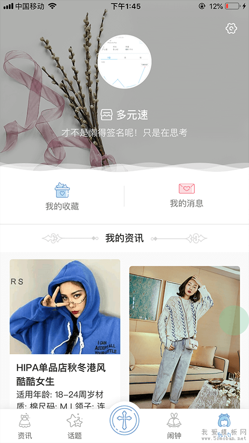
我爱模板网做最近就利用column属性,做了一个瀑布流,但是,发现瀑布流顶部不对齐,如下:
css代码:
.waterfall{
    padding: .2rem .28rem;
    column-count: 2;   //显示两列
    column-gap: normal;  //列间距
}
.waterfall .item{
    width: 3.2rem;
    overflow:hidden;
    box-sizing: border-box;
    break-inside: avoid;   //列里面的项不折断
    margin-bottom:.19rem;
}
.waterfall .item-content{
    background:rgba(255,255,255,1);
    border-radius:.08rem;
    box-shadow:0px .04rem .16rem 0 rgba(0, 0, 0, 0.04);
}
.waterfall .item-pic{
    position:relative;
    width:3.20rem;
    overflow: hidden;
}
html代码:
<div class="waterfall">
<div class="item" tapmode @click="openDetailWin(item.topicId)" v-for="(item,index) in list" @key="index">
<div class="item-content">
<div class="item-pic">
<img v-if="item.imageUrl1" :src="imgSrc+item.imageUrl1">
<img v-else src="../../image/error_img.png">
</div>
<div class="item-padded">
<div class="item-title">{{item.topicTitle}}</div>
<div class="item-desc">{{item.topicContent}}</div>
<div class="item-small tf-flex tf-flex-between tf-margin-t-10">
<span>{{item.commentCount}}评论 {{item.likeCount}}赞</span>
<span>{{func.time2desc(item.addTime)}}</span>
</div>
</div>
</div>
</div>
</div>
找了半天,发现是 item 的 margin-bottom 导致的:第一列的最后一个item的margin-bottom跑到第二列第一个item上面了,改成padding-bottom即可,因为padding属于内容,只要不折断,就不会跑到另一列最终效果图:

此外,我爱模板网发现,除了margin会断裂,定位出去的也会断裂,所以,如果想让内容不断裂,一定要让它包含在item里面。
部分素材资源来源网站,本站提供免费下载,如有侵权请联系站长马上删除!